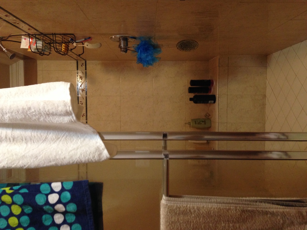
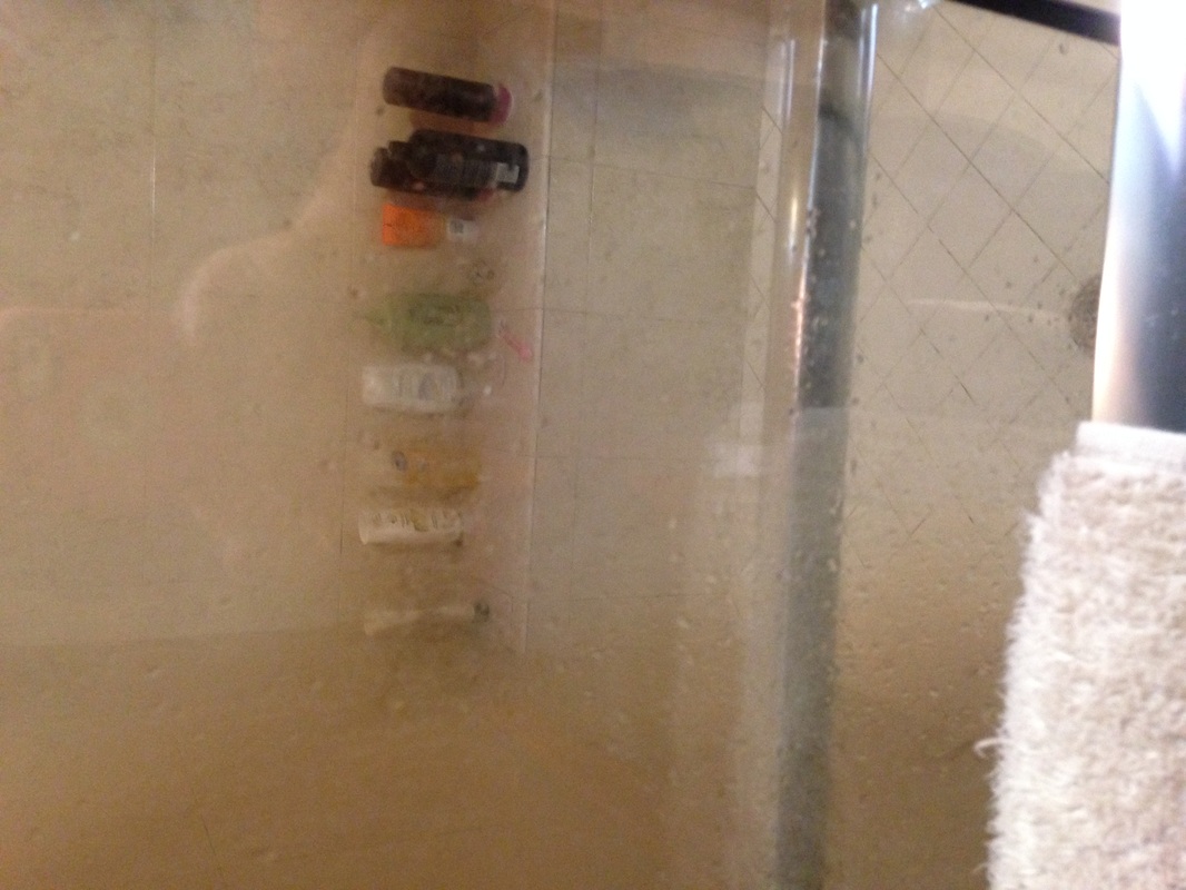
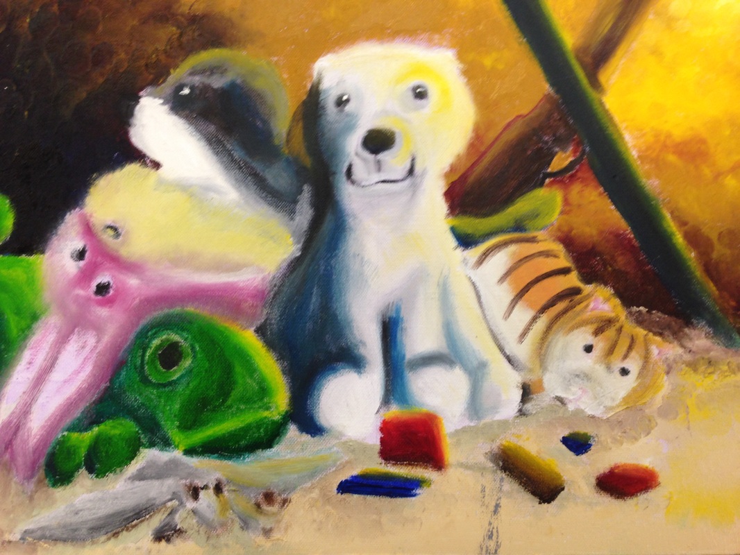
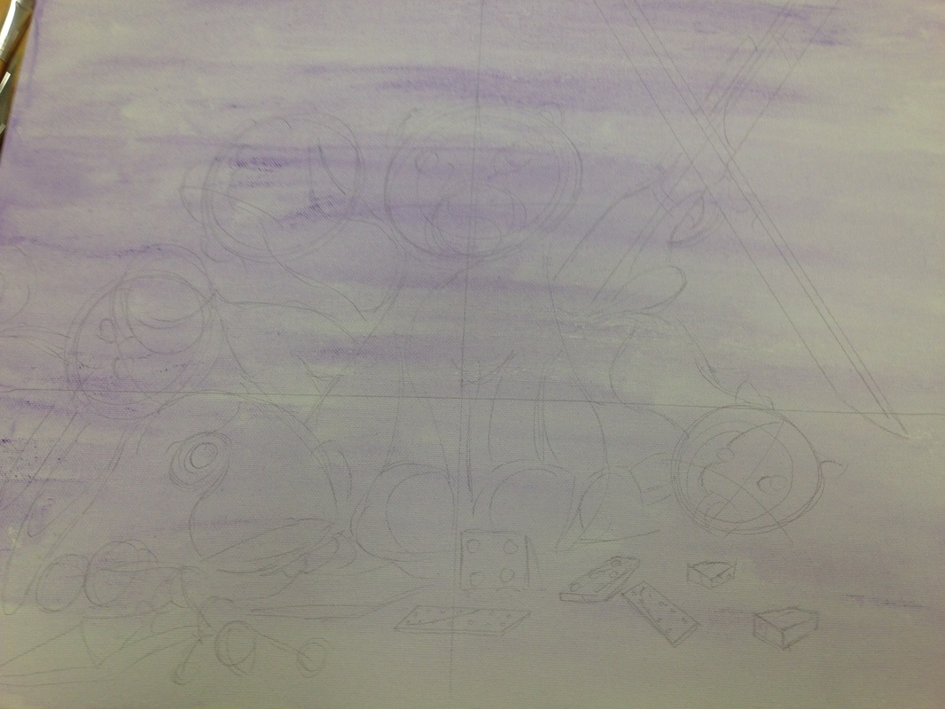
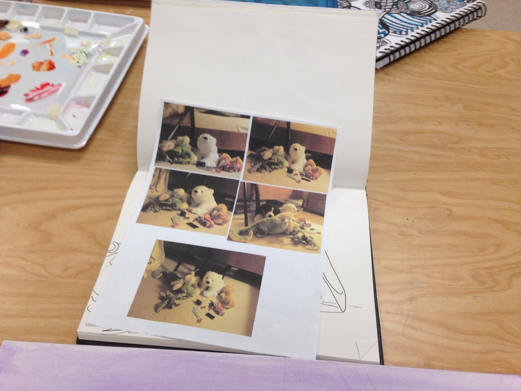
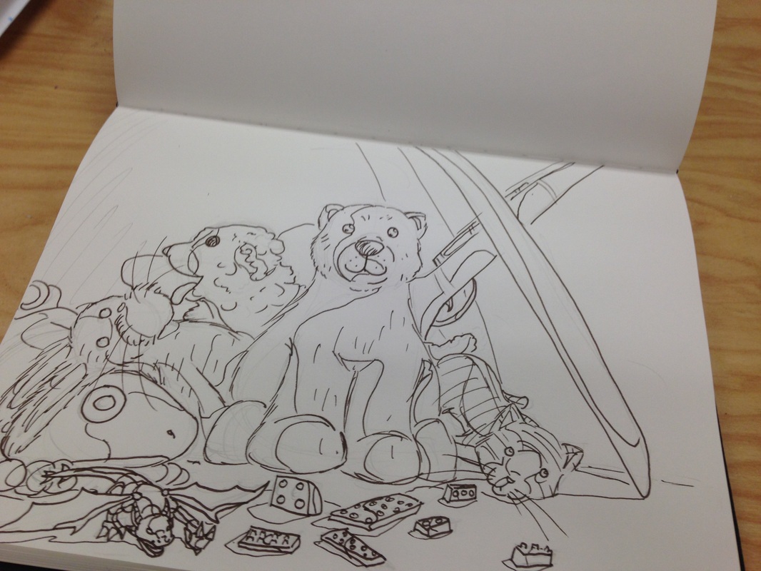
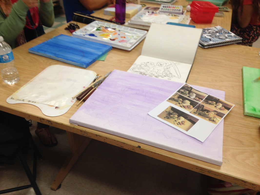
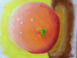
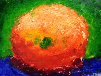
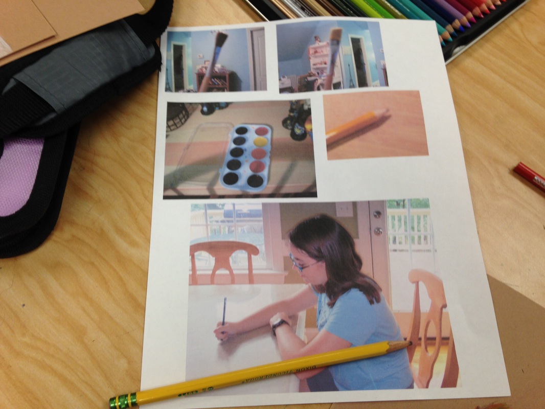
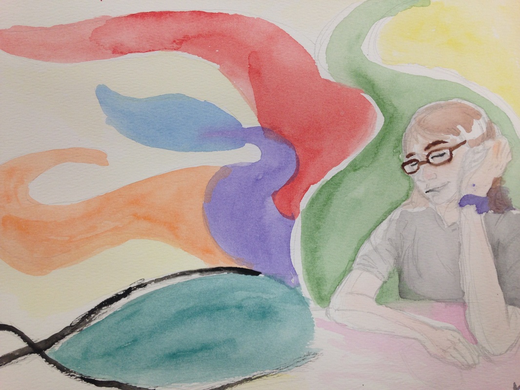
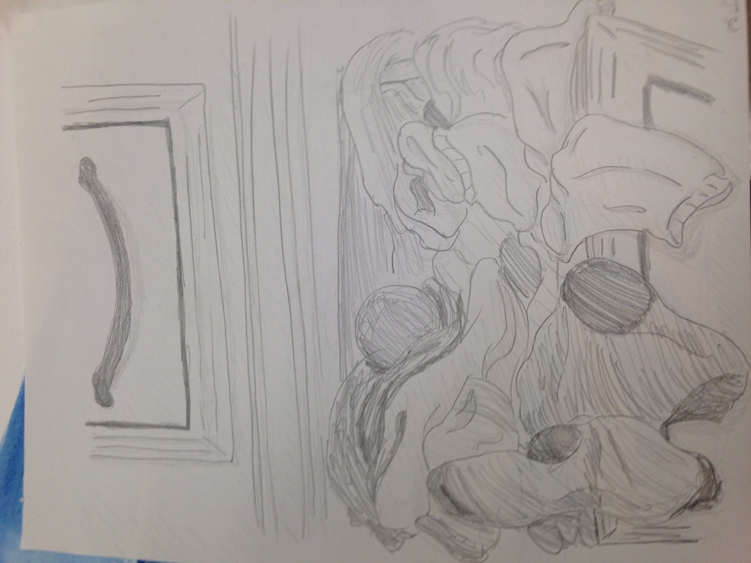
Posted below for this project are several practices and photos for references of what I used for the strange interiors project. For this one, I chose to use my parent's shower, mainly because everything else I had picked was either already being done, or the pictures for looked abhorent. I was very much intrigued by the composition of the shower, mainly because it was from a straight on perspective, something that might seem plain, but combined with the lighting and arangement of the items inside, I found it to be interesting and unique, great for a project. I wanted to try chalk pastels with this one. Mainly because I never use them, but also because I thought the wavy and smugged outlines would create a steamy effect, as if the shower was recently.
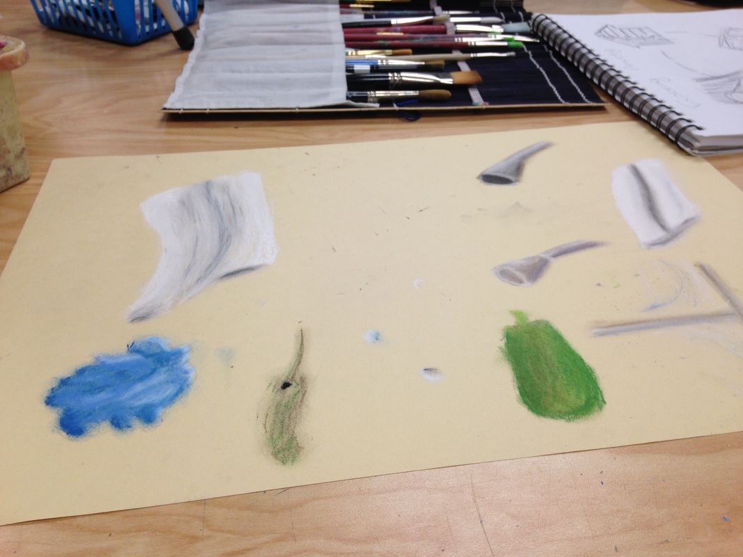
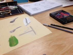
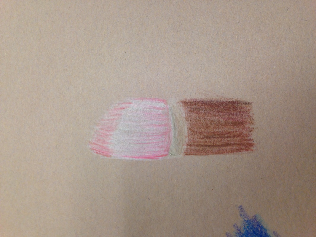
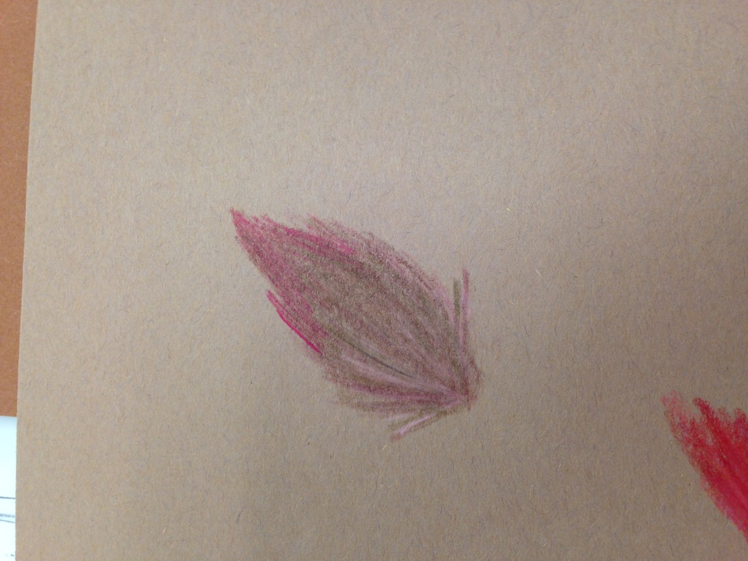
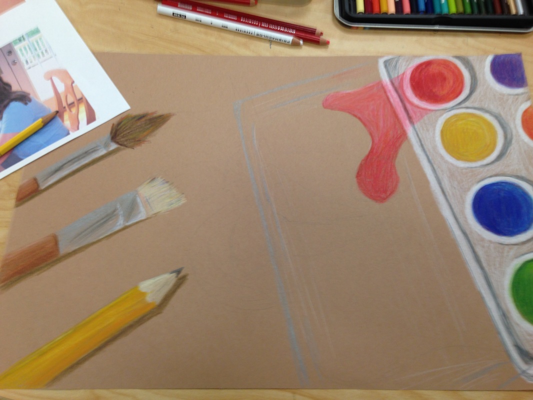
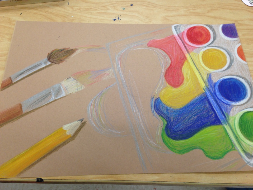
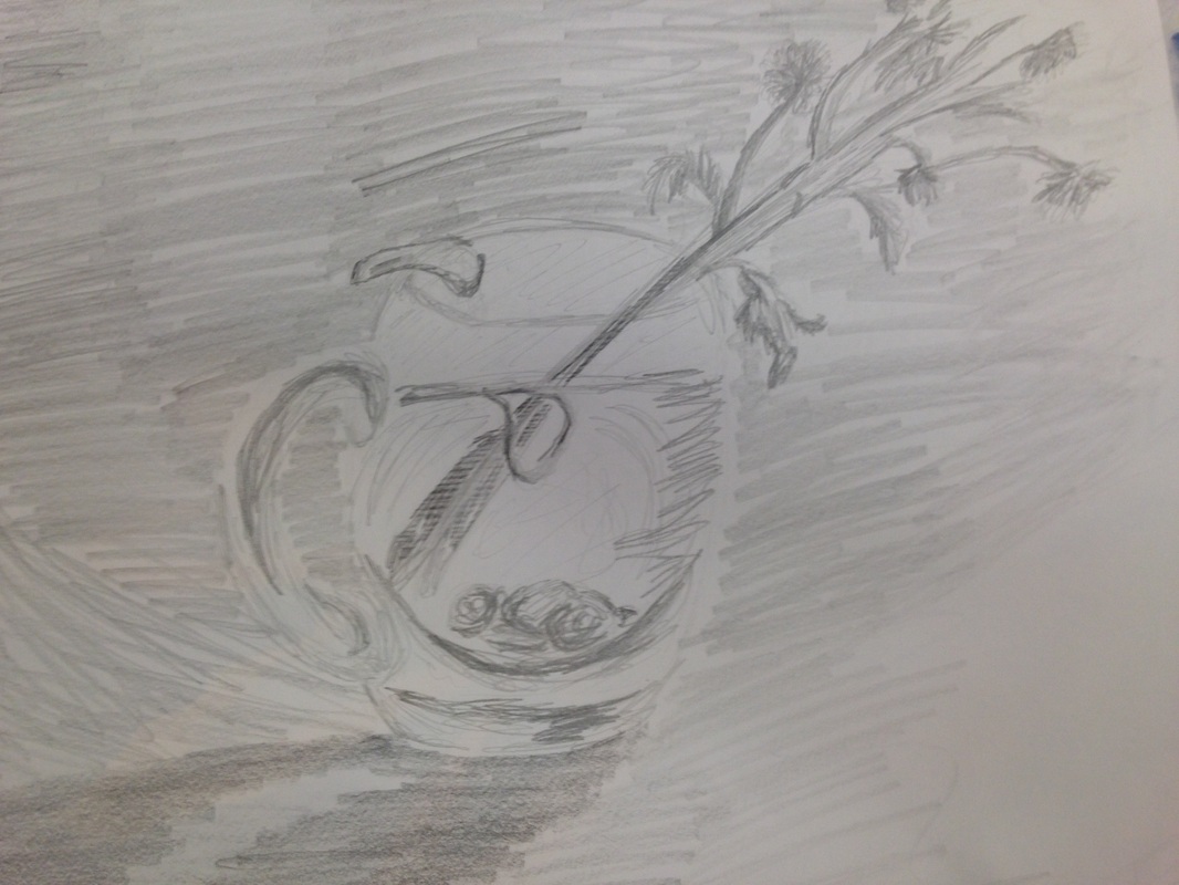
I spent a lot of time practicing with the chalk on different aspects of the shower, mostly the towles and the metal spikits and handles, as I thought those were the ones I would have the most trouble with. I combined a few light browns from the shower color with lots of grey and white, and it created the nice metalic effect that I was looking for. It mached what was on the pictures pretty accuratetly. I also practiced trying to simulate water droplets on the glass door with combinations of blue, white, and silver. (I used a lot of grey in this project.) I was less pleased with the dropplets than I was with the shower head, but it looked passible. Not as crisp and reflective as I had invissioned, but it would have to do. I think I'm ready to start the next project.
I spent a lot of time practicing with the chalk on different aspects of the shower, mostly the towles and the metal spikits and handles, as I thought those were the ones I would have the most trouble with. I combined a few light browns from the shower color with lots of grey and white, and it created the nice metalic effect that I was looking for. It mached what was on the pictures pretty accuratetly. I also practiced trying to simulate water droplets on the glass door with combinations of blue, white, and silver. (I used a lot of grey in this project.) I was less pleased with the dropplets than I was with the shower head, but it looked passible. Not as crisp and reflective as I had invissioned, but it would have to do. I think I'm ready to start the next project.
 RSS Feed
