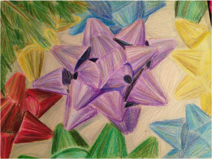
Over the past month, our teacher has had us create a piece with color pencil to send into the color pencil magazine for their monthly challenge instead of our regular weekly art homework. For their challenge, they had us recreate a photo of bows in anyway we saw fit. So for mine, I got started earlier than others with a small sheet of vanilla paper and cropped the picture in a way that focused on one large, central bow with the others radiating around it. With that set up, I wanted to add a bit extra in order to give the picture some christmas flare. What better way than to add a christmas tree into it? Or a few branches at least. So I placed it in the corner, covering a few bows in the process. I did my best to imitate the highlights and shadows from the different parts of the bows. Turns out, all you need to draw bows, is lots of triangles. I also used different colors in the lighter spots to act as reflections on the bows of the lights from the tree. I thought it would add a nice atmospheric effect. A few parts on some of the bows in the corner could have been done neater if I had actually paid attention to my lines, but the overall product looks nice. The only thing I have to complain about is the appliction process on flikr. I had no idea how to enter my picture as a beginer project, so I just left a comment, hoping the people running the competition would notice.
Next in the last few projects is another choose your own type. However, this one isn't as free as the last because these slots are being used as the start for our concentration projects. For my concentration, I chose to format it like a story, where each picture tells a different part of what's going on. Mine will be entirely digital and follows the journey of a lone cat wondering through the wilderness on his way to an unknown destination. Most of the pictures will involve elaborate settings and places, with some more story or action oriented than others. The idea came about from the fact that I love drawing cats and happen to be very good at it. From proportion to how they move, all of it looks crisp and accurate. So I decided to use my strengths and base my entire concentration around that.
The first piece I simply titled "Starting Out". Our protagonist, the cat, has received his call to venture out and into the wide world ahead. Originally, he lived in a small village consisting of plain houses all with orange-red roves powered by a tall windmill on the edge. And as he steps out on the first leg of his journey, the cat casts a forlorn look back at the home he leaves behind. I tried to capture the warmth of the early morning sun with the soft, yellow lighting shining on the hills and the houses, as well as the sadness and hesitation in the cat's expression. During the process of drawing this, I found that if you shrink the blending tool and use it on the other fur colors on the cat, like the stripes or his stomach fur, the blend and transition from one to another, making it look like it was actually part of his fur. I feel confident about how the project is going so far, and I already have several ideas for what I plan to do in the future. The class is now winding down to their last four projects for the semester. After this, we finish with our breath pieces and we move on to our concentration work instead. The first of these last few is our choice of landscape picture. It could be anything, as long as we had been there before. I found it to be an interesting and creative prompt, and I've felt more attached to this project than I have compared to any others, and I already knew exactly what picture I wanted to use. Not to long ago, my family took a trip down to San Francisco down in California. As it was the first time me and my siblings had been to the west coast, we decided to take a drive down a highway that ran along the pacific ocean. Along the way, we spotted an outcropping of rock stretching into the ocean, topped with a lighthouse as well as a few other houses. We were approach it at an angle that seemed perfectly composed and eye catching, and on a whim I took a picture. And boy am I glad I did. This was the perfect opportunity to finally make use of one of the many useless pictures stored on my phone. When it came to the issue of what medium to use, I took a look at the different textures and qualities in the setting and decided to take a chance by going back to a past medium, oil paints. My last attempt was good, but I still wasn't exactly comfortable with the paints, as they were just so different from acrylics. In how they spread, mix, look on the canvas, all of it is new and hard to get used to. But I had a plan, an idea, and I was sure that if I tried and though carefully, I could try again and maybe even do better. I am amazed at how it looks. More specifically, the water. I applied layers of color, dark and light blues, white, yellow, all stuck on with globs and swift strokes on the canvas. It left a wavy pattern, and if you touch it, it even has texture. I added white to give a reflection on the water's surface, and it looks so good! It blended well with the ocean color and it looks very natural and smooth. I chose to change the setting to a night scene, mainly because I wanted to capture the lighthouse's main feature, the light. Not to mention, I love making stars in the sky. So many of my digital pictures incorporate it in some way. Something I learned about stars from astronomy is that they actually glow in all sorts of different colors, so I added layers of white, yellow, red, and blue across the night sky in an effort to simulate a clear night sky. I also tried to put in a visible milky way, just as something extra for the sky, though all it ended up as was a cluster of stars. But that's okay. The only bit I'm not happy with is the lighthouse light. I'm not sure how it happened, but the yellow spread out everywhere, and it covered the stars, and it just doesn't look right. It doesn't feel as real or blend as nicely with the other surroundings, but I'm not sure how to fix that. I do believe I achieved my goal of getting a better handle on oil paints. The brush strokes in this one look much cleaner and nicer, and the water texture stands out as extraordinary. I will be sure to pack this one away in my tool belt for later. |
AuthorThis site is ment to act as a sort of digital portfolio for the things I do and the art I create. Archives
May 2015
Categories |