I started out with the first picture of my dog at a weird angle facing the camera, and the result was less than pleasant. His head was lopsided, the perspective was off, and the teacher described my strokes and shading as too loose and scribble-like, which it was. I felt devastated. I had worked for two days on this, and nothing was making it better. Which is when I asked for help. First, the teacher looked at my reference picture and suggested I take another one. The only issue is that my dog refuses to stay still. He's the jitteriest thing and even when he is sitting, the pictures came out blurry, like he's in a constant state of vibration. I called on my mom for help getting him still, so we used his one true weakness; food. Mom took a dog treat and held it closed in her hand as she gave the command "sit." My dog immediately rolled back and practically slammed down on the floor in his eagerness. That was as still as I could get him. So I printed the picture out and took it from there. The next day in class I cut a new piece of paper to start with. But before I worked on the final, my teacher suggested I practice drawing it in my sketchbook. I spent time trying out getting his head shape, mussel length, and paws right, and practiced fur detailing, which is a very monotonous process involving small strokes and flicks with the pencil that are slowly layered into a more detailed picture. Afterwards, I shifted to the final canvas. I spend a while placing down the basic shapes to form my dog around, and after perfecting the position of his head, I started with the outlines. With quick strokes as instructed to simulate fur, I sketched out the basic outlined before moving in with a darker pencil to detail the shadows. I worked out from there, dark to light, with varying shades of pencils to add more detail and effect. This is what took most of my time. I layered and layered, showed it to my teacher, who then told me to keep layering. Rinse and repeat for about a week and a half until I decided he was layered enough. Though my teacher also suggested I add a background to cover the blank white space. I had honestly not thought about it, I just figured leaving the page blank would be satisfactory, but in the end I did decide to recreate what was visible of the kitchen from the picture's perspective with painstaking effort put into making sure the wood lines when the right way to make good perspective. At long last, it was finally done. And I can say I have never been so pleased with a final than this. Maybe it's because of the rough start or the fact that so much work went into this one, but this is the best drawing of my dog I've ever done, and I feel like I really earned this picture this time. I learned in the end, to never underestimate pencil. Never.
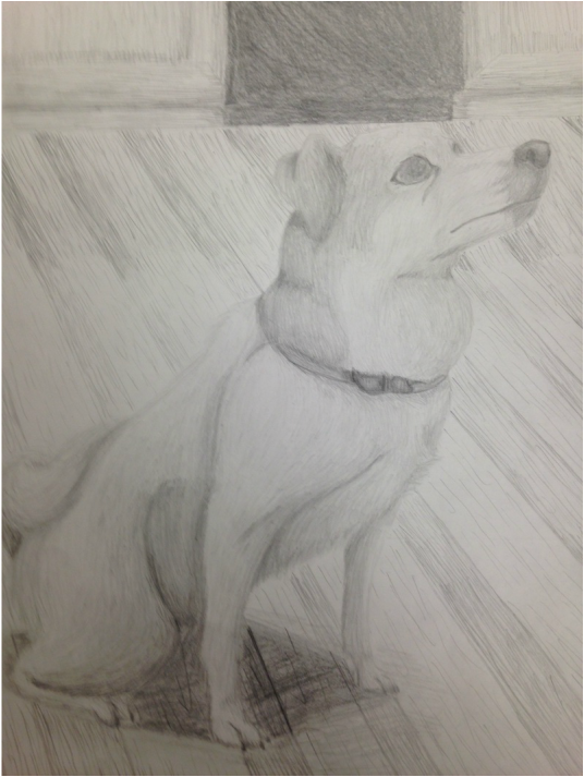
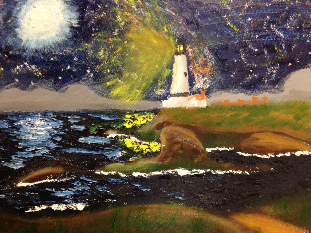
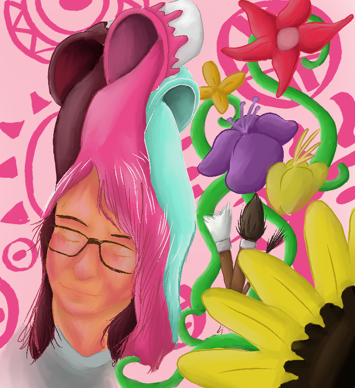
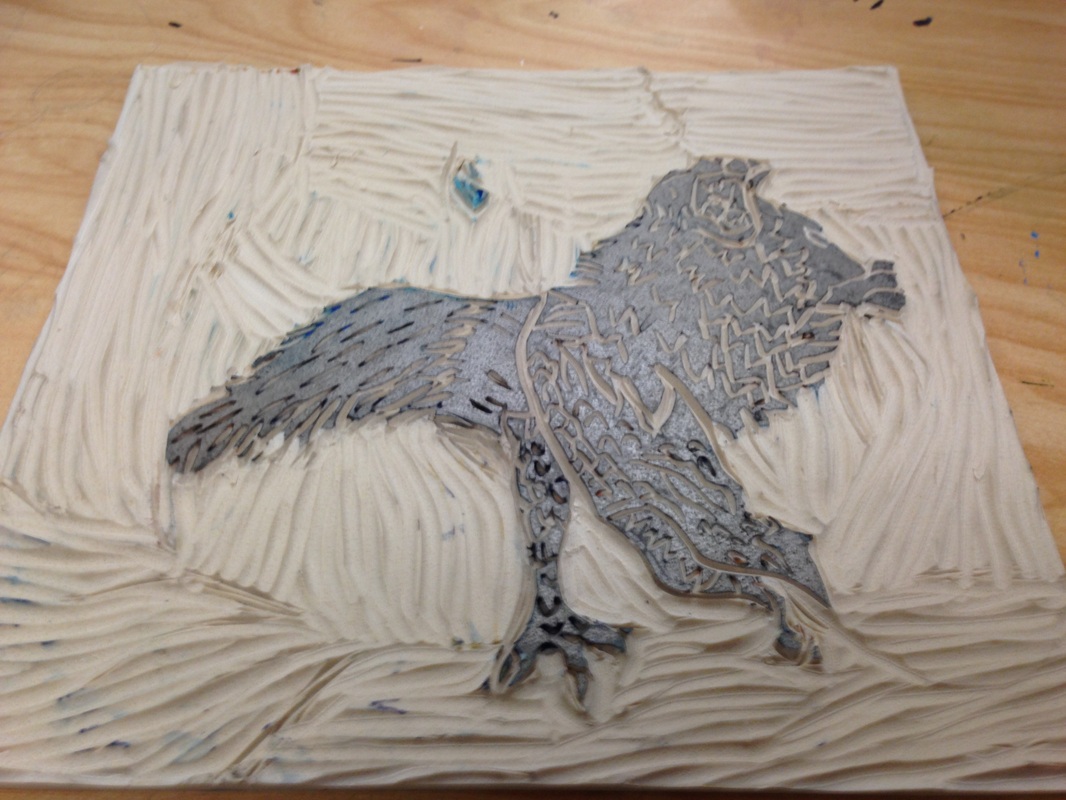
This has to be the longest project I've done so far in class. This took about two weeks to complete with lots of revision and painstaking detail that taught me a lesson I won't soon forget about pencil. This project entailed snapping a photo of our pet and recreating it in some medium, which proved to be easier for others since most of their projects were pet portraits. I thought this would be simple, and I was actually excited for it as I pride myself on being good with drawing animals. They were what I started with, and I've been practicing everything from cats to dogs to birds since middle school began. However, the difficulty was in choosing pencil as my medium. Just pencil. It was something I worked with rarely, simply because I found it difficult, so I thought combining the two would balance it out and give me more practice with the stubborn medium. Unfortunately that was not the case.
I started out with the first picture of my dog at a weird angle facing the camera, and the result was less than pleasant. His head was lopsided, the perspective was off, and the teacher described my strokes and shading as too loose and scribble-like, which it was. I felt devastated. I had worked for two days on this, and nothing was making it better. Which is when I asked for help. First, the teacher looked at my reference picture and suggested I take another one. The only issue is that my dog refuses to stay still. He's the jitteriest thing and even when he is sitting, the pictures came out blurry, like he's in a constant state of vibration. I called on my mom for help getting him still, so we used his one true weakness; food. Mom took a dog treat and held it closed in her hand as she gave the command "sit." My dog immediately rolled back and practically slammed down on the floor in his eagerness. That was as still as I could get him. So I printed the picture out and took it from there. The next day in class I cut a new piece of paper to start with. But before I worked on the final, my teacher suggested I practice drawing it in my sketchbook. I spent time trying out getting his head shape, mussel length, and paws right, and practiced fur detailing, which is a very monotonous process involving small strokes and flicks with the pencil that are slowly layered into a more detailed picture. Afterwards, I shifted to the final canvas. I spend a while placing down the basic shapes to form my dog around, and after perfecting the position of his head, I started with the outlines. With quick strokes as instructed to simulate fur, I sketched out the basic outlined before moving in with a darker pencil to detail the shadows. I worked out from there, dark to light, with varying shades of pencils to add more detail and effect. This is what took most of my time. I layered and layered, showed it to my teacher, who then told me to keep layering. Rinse and repeat for about a week and a half until I decided he was layered enough. Though my teacher also suggested I add a background to cover the blank white space. I had honestly not thought about it, I just figured leaving the page blank would be satisfactory, but in the end I did decide to recreate what was visible of the kitchen from the picture's perspective with painstaking effort put into making sure the wood lines when the right way to make good perspective. At long last, it was finally done. And I can say I have never been so pleased with a final than this. Maybe it's because of the rough start or the fact that so much work went into this one, but this is the best drawing of my dog I've ever done, and I feel like I really earned this picture this time. I learned in the end, to never underestimate pencil. Never.
0 Comments
Here we have project number 10, one of the last of the semester before we move into the second half of the year. This one is another choice, desegnated as the second in our concentration. As with all the others, I created this one digitally with a program on my tablet called Manga Studio 5. For the next step in the leg of our protagonist's journey, he has stepped from beyond his home and entered an expansive plain of rolling hills and long, wavy fronds of yellow grass. The wide open space stretched as far as he could see, up to the horizon where land met the sky. A lack of anything else for miles caused a pit of worry to grow within his stomach as the weight of exactly how far he would have to travel began to sink in. Taking a breath and trying to dispel any growing worry, he started off on what were the first steps of his travels, with "A Whole Lot of Nothing and a Long Way to Go." Pretty self-explanatory title.
The idea for this picture came along with when I decided on the first. I wanted the whole thing to start slow, testing the atmosphere and establishing the mood of adventure yet creeping uncertainty. After all, he's venturing into the wild world, full of dangers and plenty of things that could kill you. It's not going to be easy. As for his eventual goal, I'll continue leaving you in the dark on that. This picture had about three layers to it's making; the background, lines, and color. Making the sky was easy, using the subtle coloring of the spray can tool to add a sunset gradient as well as the hazy outline of the setting sun. The hard part, really, was the grass. The program has a cool effect lines tool where any line you put down is shaped into a sort of crescent look with narrowed tips. It's a dynamic look, and I decided to use it for the grass. I spend forever layering on different levels and sizes of grass, trying to be careful to not have the farther off sections of grass cover the cat, and even with the ones that did, I still tried to keep them visible. I used layers of dark green, a lighter green, as well as some of the colors of the sky reflecting on the field. It looked nice, but it also looked a bit... separated. So to solve this, I decided to blend the colors together. For the most part I succeeded. I kept the blend tool small so that it would mix colors while still keeping the grass' shape. It looks a bit hazy, but I think that works better. I kind of want to try to use other types of lines for the next one, just to see if I can make them look good, too. The end product is satisfactory, and I am already planing for the next one. Over the past month, our teacher has had us create a piece with color pencil to send into the color pencil magazine for their monthly challenge instead of our regular weekly art homework. For their challenge, they had us recreate a photo of bows in anyway we saw fit. So for mine, I got started earlier than others with a small sheet of vanilla paper and cropped the picture in a way that focused on one large, central bow with the others radiating around it. With that set up, I wanted to add a bit extra in order to give the picture some christmas flare. What better way than to add a christmas tree into it? Or a few branches at least. So I placed it in the corner, covering a few bows in the process. I did my best to imitate the highlights and shadows from the different parts of the bows. Turns out, all you need to draw bows, is lots of triangles. I also used different colors in the lighter spots to act as reflections on the bows of the lights from the tree. I thought it would add a nice atmospheric effect. A few parts on some of the bows in the corner could have been done neater if I had actually paid attention to my lines, but the overall product looks nice. The only thing I have to complain about is the appliction process on flikr. I had no idea how to enter my picture as a beginer project, so I just left a comment, hoping the people running the competition would notice.
Next in the last few projects is another choose your own type. However, this one isn't as free as the last because these slots are being used as the start for our concentration projects. For my concentration, I chose to format it like a story, where each picture tells a different part of what's going on. Mine will be entirely digital and follows the journey of a lone cat wondering through the wilderness on his way to an unknown destination. Most of the pictures will involve elaborate settings and places, with some more story or action oriented than others. The idea came about from the fact that I love drawing cats and happen to be very good at it. From proportion to how they move, all of it looks crisp and accurate. So I decided to use my strengths and base my entire concentration around that.
The first piece I simply titled "Starting Out". Our protagonist, the cat, has received his call to venture out and into the wide world ahead. Originally, he lived in a small village consisting of plain houses all with orange-red roves powered by a tall windmill on the edge. And as he steps out on the first leg of his journey, the cat casts a forlorn look back at the home he leaves behind. I tried to capture the warmth of the early morning sun with the soft, yellow lighting shining on the hills and the houses, as well as the sadness and hesitation in the cat's expression. During the process of drawing this, I found that if you shrink the blending tool and use it on the other fur colors on the cat, like the stripes or his stomach fur, the blend and transition from one to another, making it look like it was actually part of his fur. I feel confident about how the project is going so far, and I already have several ideas for what I plan to do in the future. The class is now winding down to their last four projects for the semester. After this, we finish with our breath pieces and we move on to our concentration work instead. The first of these last few is our choice of landscape picture. It could be anything, as long as we had been there before. I found it to be an interesting and creative prompt, and I've felt more attached to this project than I have compared to any others, and I already knew exactly what picture I wanted to use. Not to long ago, my family took a trip down to San Francisco down in California. As it was the first time me and my siblings had been to the west coast, we decided to take a drive down a highway that ran along the pacific ocean. Along the way, we spotted an outcropping of rock stretching into the ocean, topped with a lighthouse as well as a few other houses. We were approach it at an angle that seemed perfectly composed and eye catching, and on a whim I took a picture. And boy am I glad I did. This was the perfect opportunity to finally make use of one of the many useless pictures stored on my phone. When it came to the issue of what medium to use, I took a look at the different textures and qualities in the setting and decided to take a chance by going back to a past medium, oil paints. My last attempt was good, but I still wasn't exactly comfortable with the paints, as they were just so different from acrylics. In how they spread, mix, look on the canvas, all of it is new and hard to get used to. But I had a plan, an idea, and I was sure that if I tried and though carefully, I could try again and maybe even do better. I am amazed at how it looks. More specifically, the water. I applied layers of color, dark and light blues, white, yellow, all stuck on with globs and swift strokes on the canvas. It left a wavy pattern, and if you touch it, it even has texture. I added white to give a reflection on the water's surface, and it looks so good! It blended well with the ocean color and it looks very natural and smooth. I chose to change the setting to a night scene, mainly because I wanted to capture the lighthouse's main feature, the light. Not to mention, I love making stars in the sky. So many of my digital pictures incorporate it in some way. Something I learned about stars from astronomy is that they actually glow in all sorts of different colors, so I added layers of white, yellow, red, and blue across the night sky in an effort to simulate a clear night sky. I also tried to put in a visible milky way, just as something extra for the sky, though all it ended up as was a cluster of stars. But that's okay. The only bit I'm not happy with is the lighthouse light. I'm not sure how it happened, but the yellow spread out everywhere, and it covered the stars, and it just doesn't look right. It doesn't feel as real or blend as nicely with the other surroundings, but I'm not sure how to fix that. I do believe I achieved my goal of getting a better handle on oil paints. The brush strokes in this one look much cleaner and nicer, and the water texture stands out as extraordinary. I will be sure to pack this one away in my tool belt for later. So our newest project is based on the idea of taking something organic and making it mechanical. Like, taking flower pedals or a fish and giving it gears, bolts, wires, and other metallic things. This prompt proved to be a wealth of ideas and creativity. I spent an entire class period brainstorming, and came up with so many ideas that it was very hard for me to narrow it down. I thought about making a factory cake; a factory in the shape of a sweet, sitting in a bakery window spewing sewage and smoke. And there was a scean of fall leaves in a tree plated with colored metal. I decided to go with a clock work cat; made of a lot of gears, pullies and bars instead of wired and circuitry. It looks more rustic and more like actual muscle and bone structure in a sense. I spend some time figuring out different compositions and angles to take the picture in, and settled on a picture I took of my cat curled on my bed. Looking at the picture, a new idea began to form. I decided I wanted to put it on a background, a scene specifically. One where the robotic cat seems to be sitting on the bed of a mechanic; with tools and bolts strewn around the sheets, drawing tools and even a tool box included in the background. To capture the harsh and smooth look of metal, I used different colored pens, sharpies specifically, to add a splash of color and lighting to the piece. I used water color for the background, as the sharpies could not color the whole thing without it looking sketchy and broken. Not only that, but the colors are muter than the sharpie, so it all sort of fades to the background, where as the objects stand out. Overall, I am very pleased with how this one turned out.
Our newest project was a self portrait done in a medium of our choice. It could be anything we wanted, as long as it was accurate and reflected something about us. By accurate, I mean proportionally accurate. Our teacher went over the basics for the distance between all the parts on a human face, and we spent the first few days of this project practicing and brainstorming for our picture. I decided that mine would be digital, a medium choice I had been wanting to use in a project for some time. For this project, I just let my imagination go with all the things it thought to add to the picture, and it ended up going really out there. The colors are varied and wild, but still complementary to each other and work well on the canvas. I went with unconventional colors for myself all surrounding a pink tone. Thus I called this piece 'Portrait in Pink,' a very fitting title. I used a combination of brushes and markers that were in the tool bar of the application I used, of which there are many, to create a variety of looks to differentiate the stuff in the foreground from the background. The pen I used to outline most of the picture is a cool effect line that corrects itself after you make a stroke on the canvas to make a cool sort of varied length amongst all the lines. Not to mention the blending tool, when turned to a smaller setting, smears the colors together in an intriguing fashion that follow the contours to a person's face very realistically. I greatly enjoyed returning to a medium I had been dying to use for a while. I hope to use it again sometime soon.
I've learned two things from this project. 1) The cardbord holder methood works much better than free handing it. Most of the picture looks slightly off-kilter. Things that should be at one part of the picture are slightly above, and a few colors don't line up right. 2) Be careful when using yellow ink. Especially on dark background. Something about it makes it come out splotchy, like a sponge instead of a solid color. It looks a bit messy and slightly ugly on a few copies.
However, I must say that it turned out looking much better in the final product than I had expected the free hand print to. After I placed down the yellow layer, I was worried the rest had been mest up. But the next few color layers covered most of the mess from sight. I also like the contrast between the darker colored brown and purple forest in the back and the more vibrant looking chimera in the foreground. I wanted to go more in depth with more colors, but time was not on my side so I switched to every part being one solid color. The texture lines shine through and add a sort of shading to the different parts of the chimera's body, as well as the trees and leaves behind. And the slightly shifty look that the offset layers give adds a nice style too. Our latest project has been a kind of pick and choose one of our own. We were given a list of topics, ideas, and medias and allowed to combine them in any creative ways we can think of. For my project, I wanted to do a print. I always loved doing prints, ever since Art II; they always had this kind of texture and style that was apealing to the eye. Luckaly, texture was on the list of ideas to choose from, which made deciding what to focus on easy. Next was to figure out what I could print that would exemplify texture. On the list of subjects there happened to be one called mythical creatures. And that's when I remembered the chimera statue I had at my house. The creature is made up of parts from many different animals. Some with scales, some with skin, some with fur, other parts with horns. Each part had a variety of shape and different quality to vary the textures found on it; a perfect figure for a print.
So I started out with a basic sketch on what the layout of the print was, then I colored it to plan out what colors to use. I wanted to make each section a different color, so that they all stood from eachother, and it was clear to see what each thing was. It's kind of hard to line the print up with the paper, however. I'm used to creating a holder for the print block out of cardboard, then sticking pins through the back and poking holes through the paper so they line up each time. Maybe it'll look better once all the colors have been added. So chalk pastel and tile are a lot harder to work with than expected. Maybe it's the fact that the tile color was beige and that it was in kind of dark lighting, or maybe I'm just not that skilled in blending pastels yet, but I though it would look a bit more vibrant at the end... Alright, first, back to the begining. I started the picture out in a landscape format, thinking that stretching it out a bit would look alright, but I ended up scraping that one due to an issue with the colors, and the lines, and the blending, it was a mess. The second one I started in portrait, like the reference picture, and I am far more pleased with this product than the last one. It just looks cleaner over all, and the colors aren't all over the place. There are still several things about it that I had an issue with. I was right about the hazzy lines looking like steam drifting in the shower, but adding the extra white over it caused a bit of smudging with the black shampoo bottles (something I should have expected). Not to mention something about the piece looks flat. It doesn't look like tiles plastered to a wall, it looks like cream colored paper with lines on it without much depth added to the shapes.
That being said, there are still many good things in the picture. I did have a lot of fun coloring the metal parts of the shower like the doors, shower head, and water switch. They were simple, mixed nicely, and captured a realistic shine that catches the eye. The scrunchy ball looks fantastic, too. One of the best made parts of the shower. The blues compliment nicely, the shadows are distinct and cool, and you can almost tell how fluffy it is. I liked making the glass, too. A little white and grey, and the whole thing looks solid and reflective. Very nice. I did get the steam look I was going for, too. That's a plus. I just wish it had a little more depth to it, but I'm not sure how that's too be done. I think I'll need a bit more instruction on chalk pastel techniques before i try it again. |
AuthorThis site is ment to act as a sort of digital portfolio for the things I do and the art I create. Archives
May 2015
Categories |