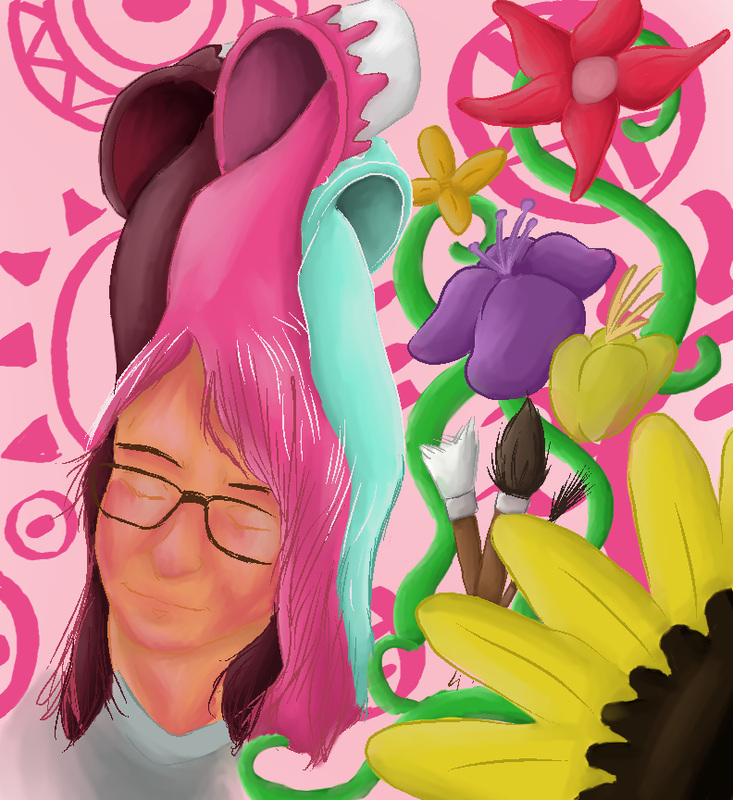
Our newest project was a self portrait done in a medium of our choice. It could be anything we wanted, as long as it was accurate and reflected something about us. By accurate, I mean proportionally accurate. Our teacher went over the basics for the distance between all the parts on a human face, and we spent the first few days of this project practicing and brainstorming for our picture. I decided that mine would be digital, a medium choice I had been wanting to use in a project for some time. For this project, I just let my imagination go with all the things it thought to add to the picture, and it ended up going really out there. The colors are varied and wild, but still complementary to each other and work well on the canvas. I went with unconventional colors for myself all surrounding a pink tone. Thus I called this piece 'Portrait in Pink,' a very fitting title. I used a combination of brushes and markers that were in the tool bar of the application I used, of which there are many, to create a variety of looks to differentiate the stuff in the foreground from the background. The pen I used to outline most of the picture is a cool effect line that corrects itself after you make a stroke on the canvas to make a cool sort of varied length amongst all the lines. Not to mention the blending tool, when turned to a smaller setting, smears the colors together in an intriguing fashion that follow the contours to a person's face very realistically. I greatly enjoyed returning to a medium I had been dying to use for a while. I hope to use it again sometime soon.
 RSS Feed
