The class is now winding down to their last four projects for the semester. After this, we finish with our breath pieces and we move on to our concentration work instead. The first of these last few is our choice of landscape picture. It could be anything, as long as we had been there before. I found it to be an interesting and creative prompt, and I've felt more attached to this project than I have compared to any others, and I already knew exactly what picture I wanted to use.
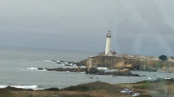
Not to long ago, my family took a trip down to San Francisco down in California. As it was the first time me and my siblings had been to the west coast, we decided to take a drive down a highway that ran along the pacific ocean. Along the way, we spotted an outcropping of rock stretching into the ocean, topped with a lighthouse as well as a few other houses. We were approach it at an angle that seemed perfectly composed and eye catching, and on a whim I took a picture. And boy am I glad I did. This was the perfect opportunity to finally make use of one of the many useless pictures stored on my phone.
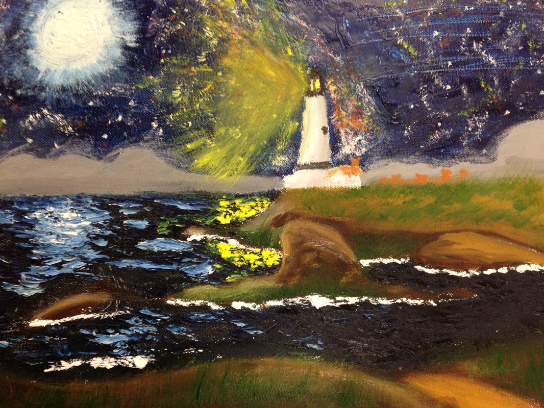
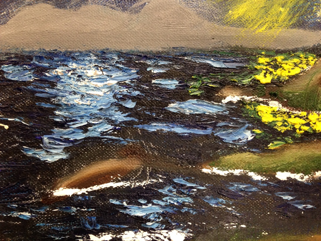
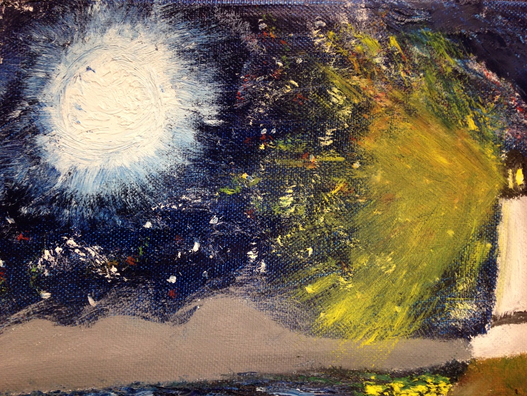
When it came to the issue of what medium to use, I took a look at the different textures and qualities in the setting and decided to take a chance by going back to a past medium, oil paints. My last attempt was good, but I still wasn't exactly comfortable with the paints, as they were just so different from acrylics. In how they spread, mix, look on the canvas, all of it is new and hard to get used to. But I had a plan, an idea, and I was sure that if I tried and though carefully, I could try again and maybe even do better. I am amazed at how it looks. More specifically, the water. I applied layers of color, dark and light blues, white, yellow, all stuck on with globs and swift strokes on the canvas. It left a wavy pattern, and if you touch it, it even has texture. I added white to give a reflection on the water's surface, and it looks so good! It blended well with the ocean color and it looks very natural and smooth. I chose to change the setting to a night scene, mainly because I wanted to capture the lighthouse's main feature, the light. Not to mention, I love making stars in the sky. So many of my digital pictures incorporate it in some way. Something I learned about stars from astronomy is that they actually glow in all sorts of different colors, so I added layers of white, yellow, red, and blue across the night sky in an effort to simulate a clear night sky. I also tried to put in a visible milky way, just as something extra for the sky, though all it ended up as was a cluster of stars. But that's okay. The only bit I'm not happy with is the lighthouse light. I'm not sure how it happened, but the yellow spread out everywhere, and it covered the stars, and it just doesn't look right. It doesn't feel as real or blend as nicely with the other surroundings, but I'm not sure how to fix that. I do believe I achieved my goal of getting a better handle on oil paints. The brush strokes in this one look much cleaner and nicer, and the water texture stands out as extraordinary. I will be sure to pack this one away in my tool belt for later.
Not to long ago, my family took a trip down to San Francisco down in California. As it was the first time me and my siblings had been to the west coast, we decided to take a drive down a highway that ran along the pacific ocean. Along the way, we spotted an outcropping of rock stretching into the ocean, topped with a lighthouse as well as a few other houses. We were approach it at an angle that seemed perfectly composed and eye catching, and on a whim I took a picture. And boy am I glad I did. This was the perfect opportunity to finally make use of one of the many useless pictures stored on my phone.
When it came to the issue of what medium to use, I took a look at the different textures and qualities in the setting and decided to take a chance by going back to a past medium, oil paints. My last attempt was good, but I still wasn't exactly comfortable with the paints, as they were just so different from acrylics. In how they spread, mix, look on the canvas, all of it is new and hard to get used to. But I had a plan, an idea, and I was sure that if I tried and though carefully, I could try again and maybe even do better. I am amazed at how it looks. More specifically, the water. I applied layers of color, dark and light blues, white, yellow, all stuck on with globs and swift strokes on the canvas. It left a wavy pattern, and if you touch it, it even has texture. I added white to give a reflection on the water's surface, and it looks so good! It blended well with the ocean color and it looks very natural and smooth. I chose to change the setting to a night scene, mainly because I wanted to capture the lighthouse's main feature, the light. Not to mention, I love making stars in the sky. So many of my digital pictures incorporate it in some way. Something I learned about stars from astronomy is that they actually glow in all sorts of different colors, so I added layers of white, yellow, red, and blue across the night sky in an effort to simulate a clear night sky. I also tried to put in a visible milky way, just as something extra for the sky, though all it ended up as was a cluster of stars. But that's okay. The only bit I'm not happy with is the lighthouse light. I'm not sure how it happened, but the yellow spread out everywhere, and it covered the stars, and it just doesn't look right. It doesn't feel as real or blend as nicely with the other surroundings, but I'm not sure how to fix that. I do believe I achieved my goal of getting a better handle on oil paints. The brush strokes in this one look much cleaner and nicer, and the water texture stands out as extraordinary. I will be sure to pack this one away in my tool belt for later.
 RSS Feed
