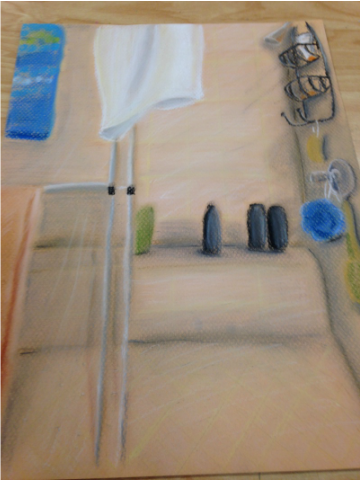
So chalk pastel and tile are a lot harder to work with than expected. Maybe it's the fact that the tile color was beige and that it was in kind of dark lighting, or maybe I'm just not that skilled in blending pastels yet, but I though it would look a bit more vibrant at the end... Alright, first, back to the begining. I started the picture out in a landscape format, thinking that stretching it out a bit would look alright, but I ended up scraping that one due to an issue with the colors, and the lines, and the blending, it was a mess. The second one I started in portrait, like the reference picture, and I am far more pleased with this product than the last one. It just looks cleaner over all, and the colors aren't all over the place. There are still several things about it that I had an issue with. I was right about the hazzy lines looking like steam drifting in the shower, but adding the extra white over it caused a bit of smudging with the black shampoo bottles (something I should have expected). Not to mention something about the piece looks flat. It doesn't look like tiles plastered to a wall, it looks like cream colored paper with lines on it without much depth added to the shapes.
That being said, there are still many good things in the picture. I did have a lot of fun coloring the metal parts of the shower like the doors, shower head, and water switch. They were simple, mixed nicely, and captured a realistic shine that catches the eye. The scrunchy ball looks fantastic, too. One of the best made parts of the shower. The blues compliment nicely, the shadows are distinct and cool, and you can almost tell how fluffy it is. I liked making the glass, too. A little white and grey, and the whole thing looks solid and reflective. Very nice. I did get the steam look I was going for, too. That's a plus. I just wish it had a little more depth to it, but I'm not sure how that's too be done. I think I'll need a bit more instruction on chalk pastel techniques before i try it again.
That being said, there are still many good things in the picture. I did have a lot of fun coloring the metal parts of the shower like the doors, shower head, and water switch. They were simple, mixed nicely, and captured a realistic shine that catches the eye. The scrunchy ball looks fantastic, too. One of the best made parts of the shower. The blues compliment nicely, the shadows are distinct and cool, and you can almost tell how fluffy it is. I liked making the glass, too. A little white and grey, and the whole thing looks solid and reflective. Very nice. I did get the steam look I was going for, too. That's a plus. I just wish it had a little more depth to it, but I'm not sure how that's too be done. I think I'll need a bit more instruction on chalk pastel techniques before i try it again.
 RSS Feed
