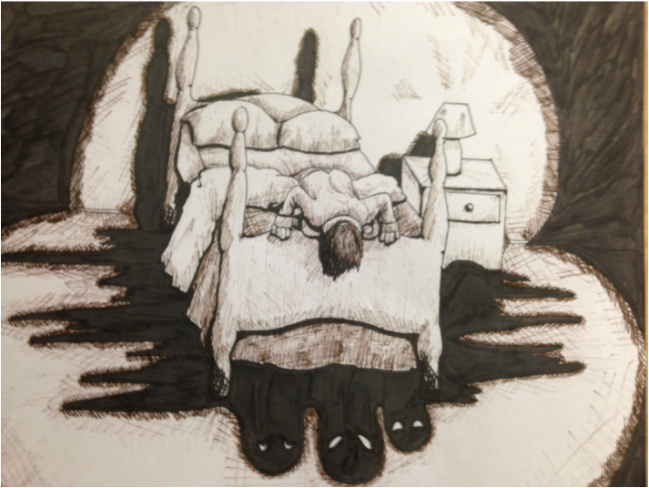
So I realized, looking back at my list of projects, that I neglected to create a final piece for my breath. I needed something that I liked, which could be done easily within a few days, and wouldn't interrupt my work on my concentration. I decided on recreating a picture that I created in a small sketchbook earlier the semester, and entirely black and white drawing in pen and ink, one that symbolized a sort of nagging fear that everyone feels at one point or another. A pestering paranoia that you can't seem to shake, often like monsters under your bed. The stark difference between dark shadows and lit bed is very striking and is good for getting across the mood of dark fears. The picture is just supposed to represent an emotion, this one a sort of paranoia or fear, and it was up to the viewer to discern what it means to them, which is what I hope they do when I send this in to the Hallie Senior art show.
The picture was easy to replicate, I already knew each angle and aspect of the design, so simply up scaling it was simple. The variety of shading on objects on the bed and across the floor involves a lot of crosshatching as well as assistance from my trusty brush pen to cover the entirely black areas. My pens started running out of ink a good ways through the picture, but I continued to use them for the lighter segments. I think the smaller amount of ink left more of a gradient look on the shadows, gives it more depth.
I am very pleased with how this project turned out. The contrast is good, composition is wonderful, subject matter adult and dark, the whole thing looks very professional. I am happy to call this the final piece in my breath.
 RSS Feed
